I design end-to-end product experiences across mobile and web — translating complexity into clarity, and turning ambiguous problems into high-quality, user-centered outcomes backed by research and grounded in real user needs.
Design + strategy, end-to-end. 15 years of product design across financial services, e-commerce, fintech, and telecom. I design complex flows, prototypes, and UI across mobile and web — grounded in research, aligned with business goals, and built to hold up through engineering handoff. I also mentor designers and advocate for the standards that keep quality consistent at scale.
I've spent years doing the work — designing flows, building systems, running critiques, mapping architectures. That hands-on design foundation allows me to understand what goes into a project from start to finish. I know exactly what it costs to change a system late, what happens when teams aren't aligned, and what a user actually needs at a decision point.
Working in this role will open up doors to operate earlier in the process. I would love to be a part of what gets built, how teams collaborate, and how experiences connect across an organization — not just executing within those constraints.
What I bring
Where I envision
Vanguard · Financial UX · Decision Systems
Tax-Efficient Retirement Strategy (TERS)
Led end-to-end product design for TERS — a complex, data-rich retirement planning tool at Vanguard. Translated financial models, Social Security timing, and Roth conversion logic into clear, navigable decision flows that advisors and clients could actually act on.
The Problem
Retirement decisions are deeply interdependent — tax-deferred vs. Roth vs. taxable, Social Security timing, withdrawal order. Existing tools lacked continuity and made it hard for users to understand tradeoffs across time.
My Role
Strategic Approach
Scope
4-year engagement · End-to-end product design · Complex data-rich financial platform · Figma + Miro · Advisor + client-facing
Reflection
TERS is the kind of complex, data-rich product where design decisions require deep domain understanding, strong information architecture, and the ability to make difficult tradeoffs legible to users and stakeholders alike.
Why It's Strategic
Working on TERS meant operating end-to-end — from understanding complex financial models with product and engineering to producing high-quality, production-ready UI that advisors and clients could trust.
Designed Interfaces — TERS Product
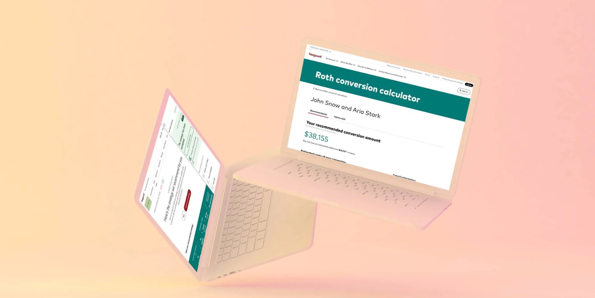
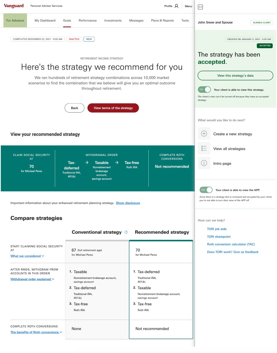
Roth Conversion Calculator — recommendation output with estimated conversion amount and tax cost breakdown
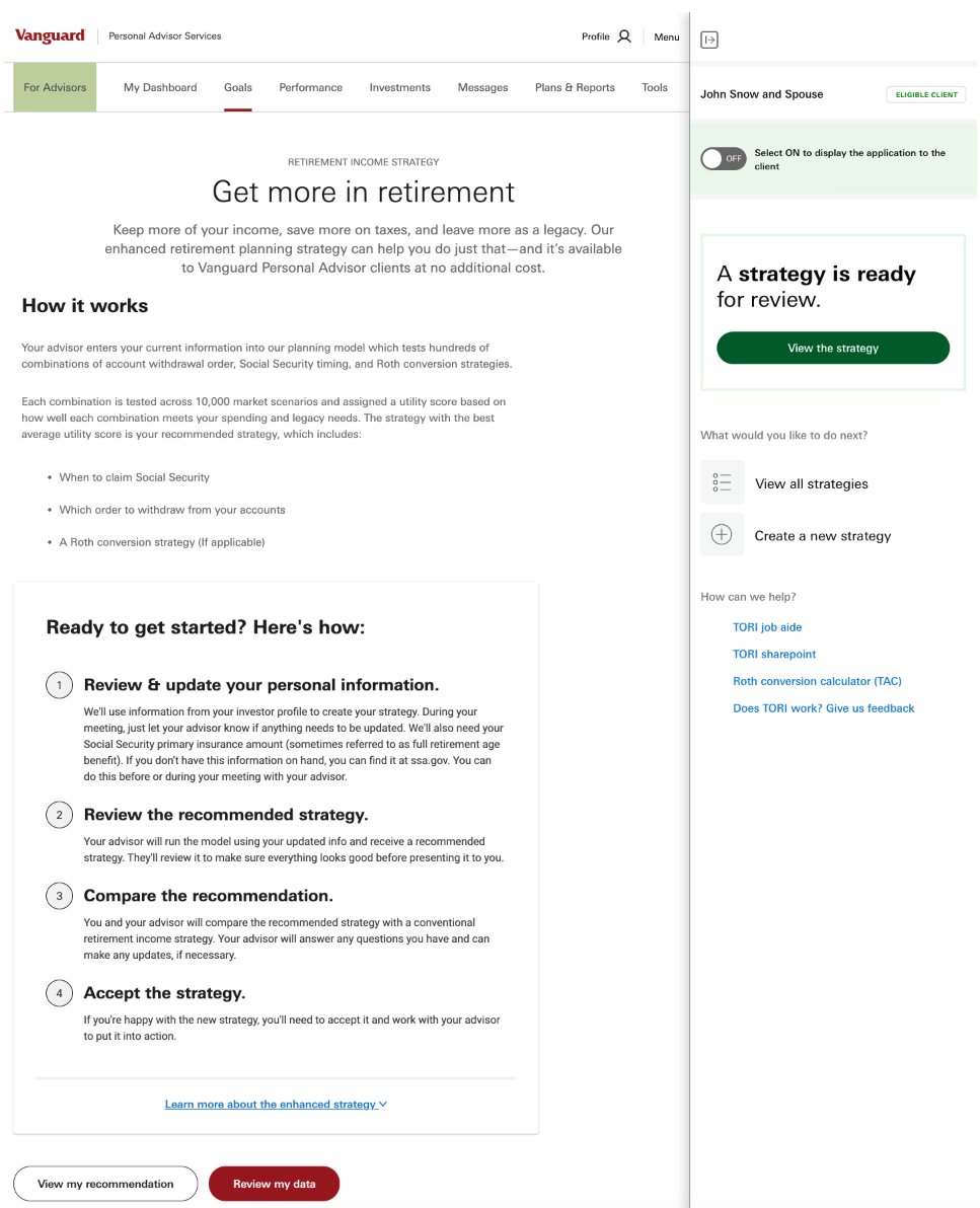
Advisor intro page — "Get more in retirement" with 4-step onboarding flow and advisor drawer
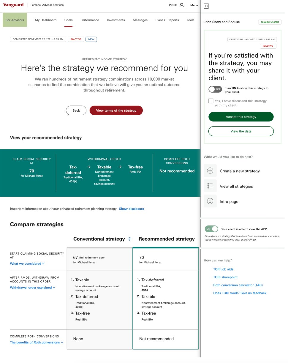
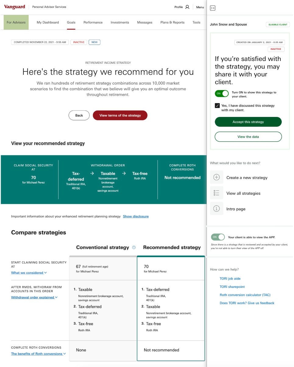
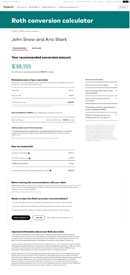
Roth Conversion Calculator — full recommendation page with tax breakdown, Medicare IRMAA, and sharing checklist
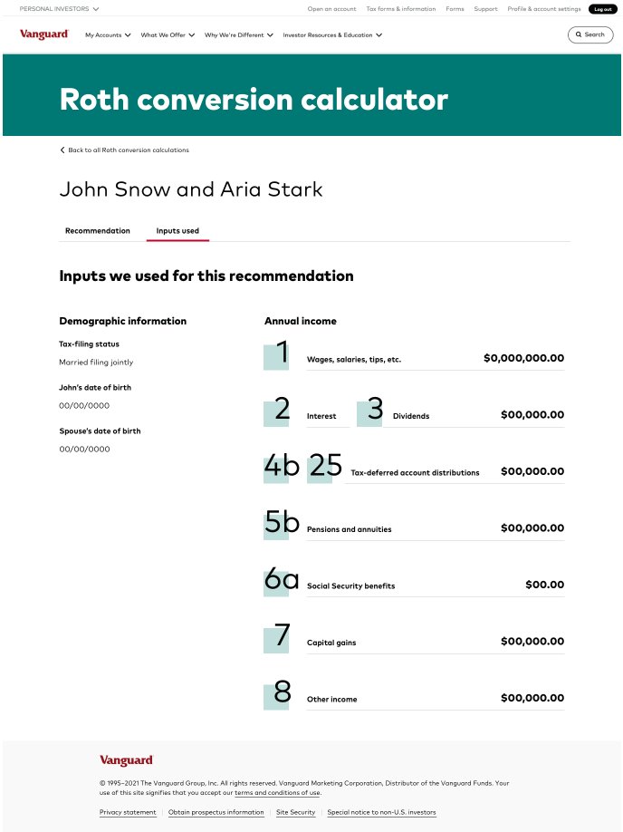
Inputs used — demographic and income inputs displayed alongside the recommendation for transparency
Process & Strategy Artifacts
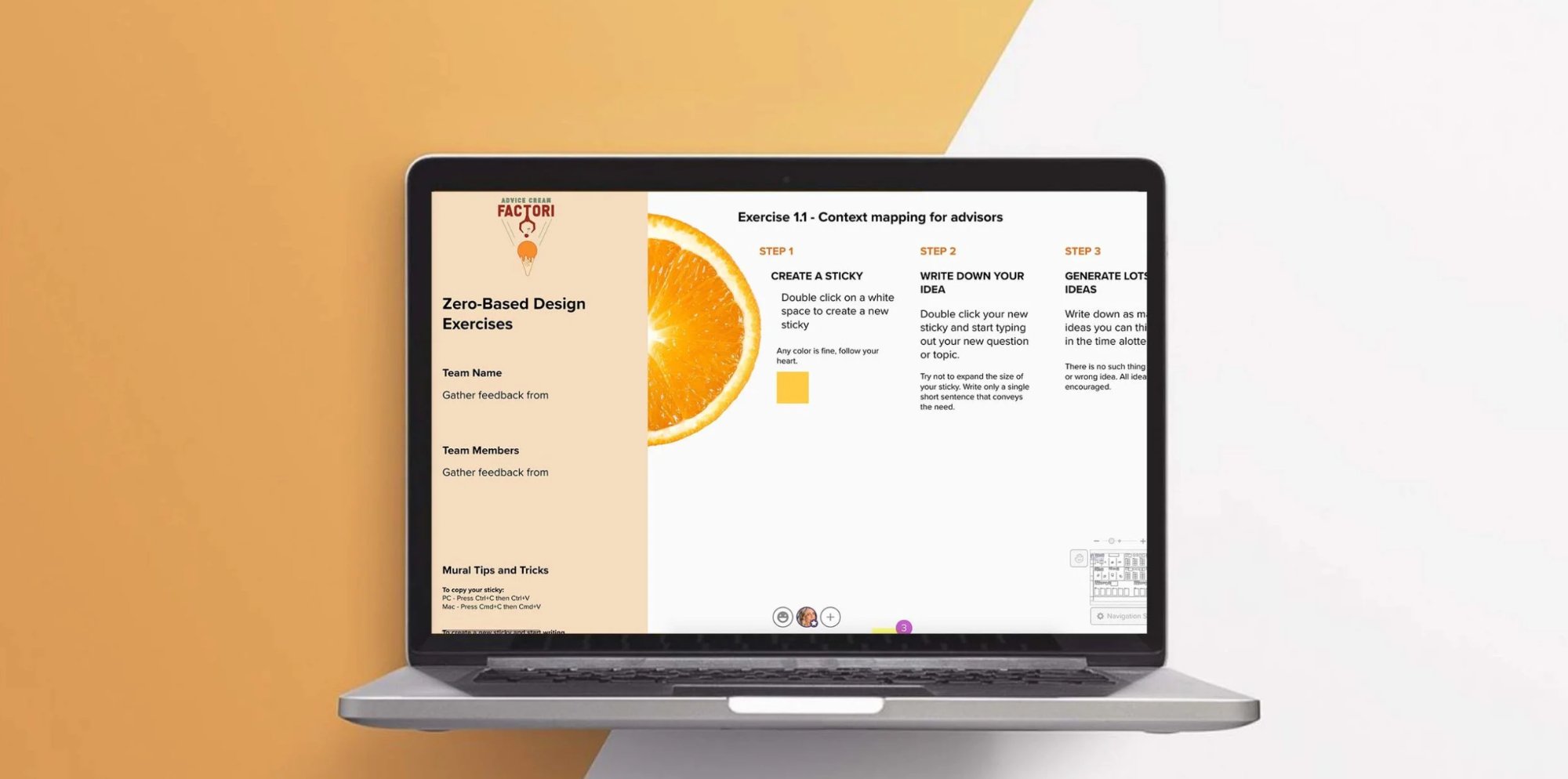
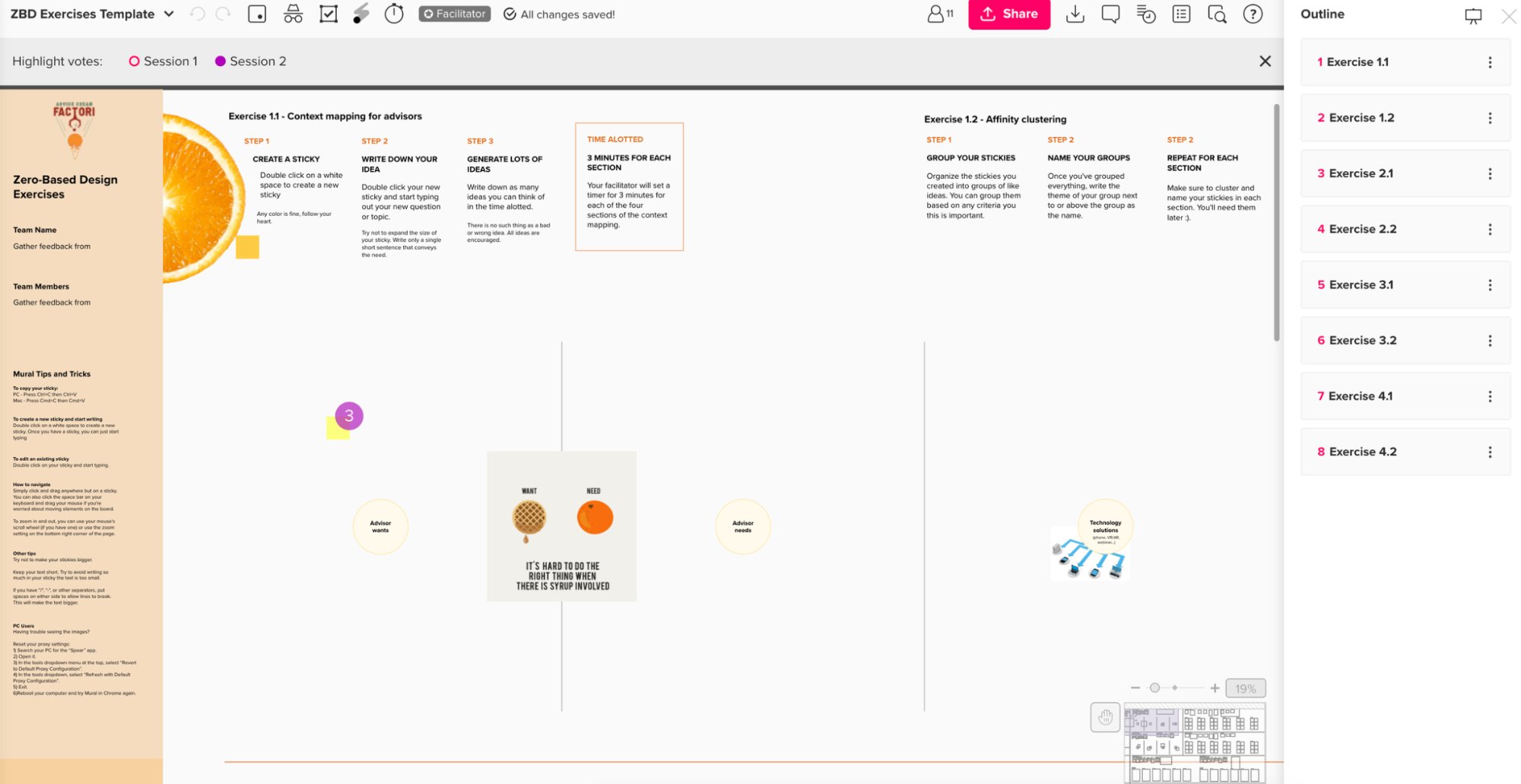
Zero-Based Design Exercises — Context mapping facilitation (laptop mockup)
ZBD Exercises Template — Context mapping + affinity clustering exercises
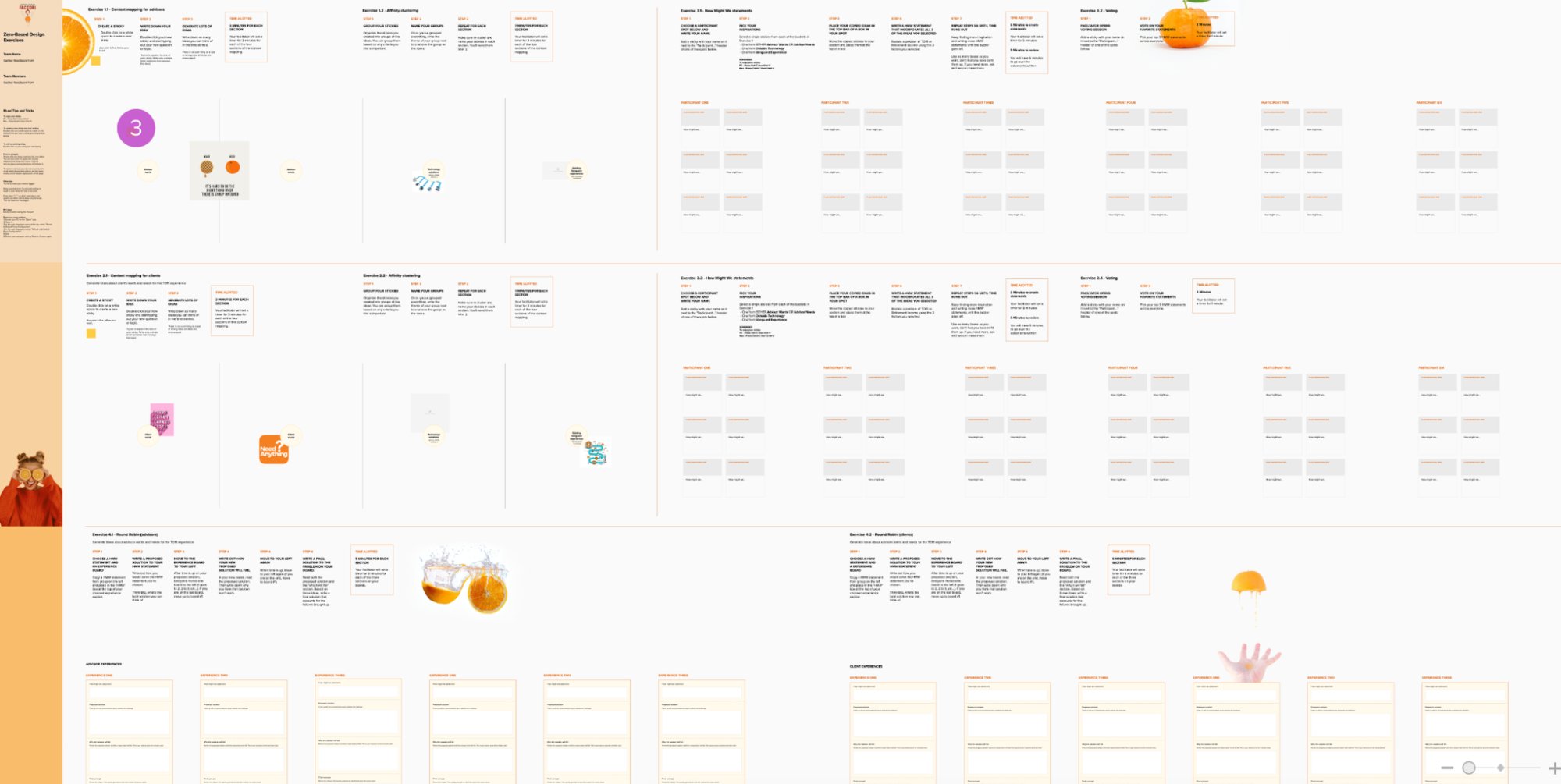
Full ZBD Mural board — advisor and client exercise sequences
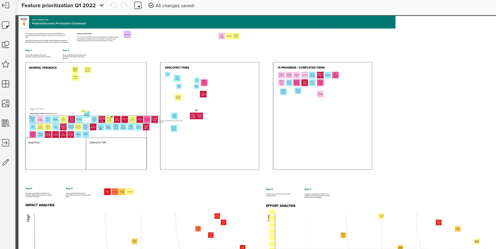
Feature/Discovery Prioritization Dashboard — Q1 2022 impact + effort analysis
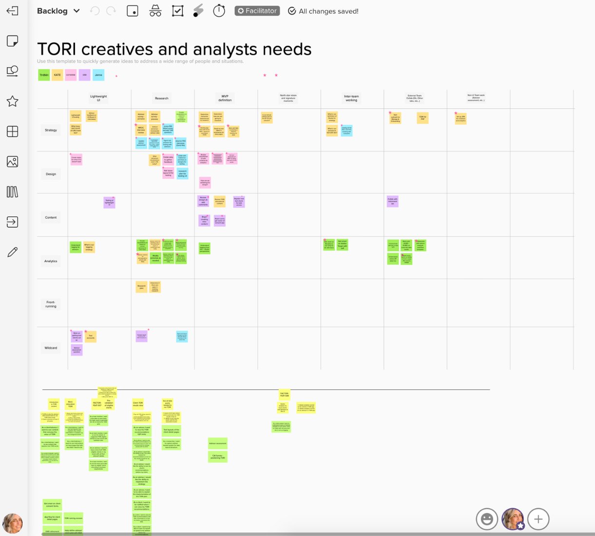
TORI Creatives & Analysts Needs — Backlog matrix across strategy, design, analytics
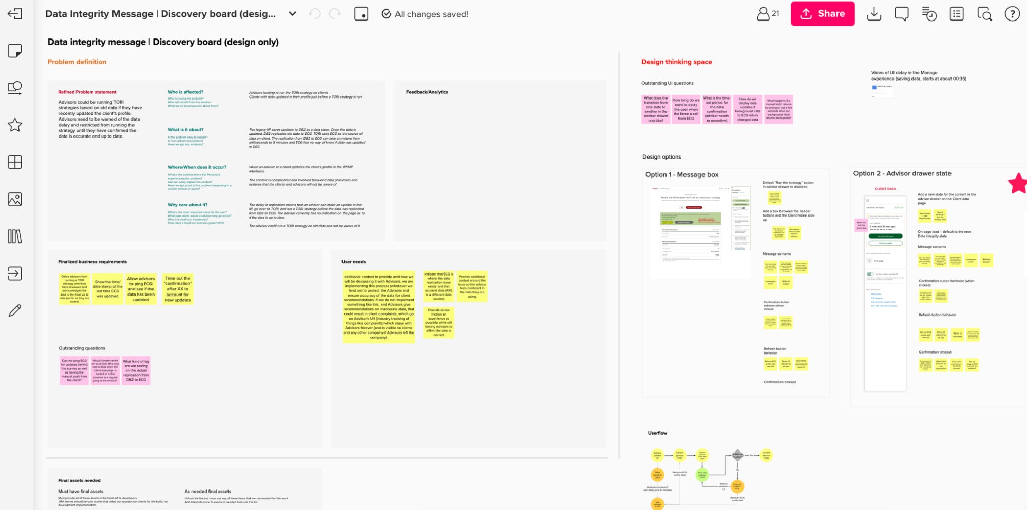
Data Integrity Message — Discovery board with problem definition, user needs, design options
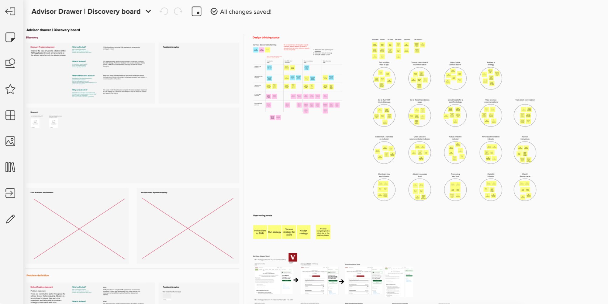
Advisor Drawer — Discovery board with user testing needs, systems mapping, advisor flows
Vanguard · Experience Architecture · Org Alignment
DA / PA / WM Experience Architecture
Defined how experiences connect across four restructured product domains — mapping user journeys, identifying fragmentation, and aligning cross-functional teams around a shared experience architecture.
The Problem
Organizational restructuring created fragmented experiences across four distinct product domains. Users encountered disconnected journeys and poor handoffs between self-service and advisor-led channels.
My Role
Strategic Approach
Stakeholders
Cross-domain IA · Multi-team alignment · Experience continuity across channels
Why It's Strategic
Pure UX Strategy — working across org boundaries to shape how an ecosystem connects, requiring organizational influence as much as design skill.
Reflection
Alignment at the org level has to come before alignment at the experience level. You can't design your way out of a misaligned system.
Visuals to be added: ecosystem / architecture diagrams · DA → PA → WM journey flows · stakeholder frameworks
Vanguard · Design Systems · Governance · Leadership
Constellation (C11n) Design System & Governance
Led the migration of Vanguard's designer team from legacy patterns to the new Constellation (C11n) design system — partnering with the VET (Vanguard Experience Team) to onboard designers, convert legacy components, run weekly cross-team critiques, and build the governance practices that made the system stick across multiple product teams.
The Problem
Multiple teams used inconsistent patterns, creating fragmentation, rework, and a lack of shared design language. The legacy system couldn't scale with organizational growth and product complexity.
My Role
Design Critique Practice
Weekly critiques created a shared forum — aligning designers, reinforcing system usage, surfacing active work, and building a culture of collective decision-making, not just individual execution.
Scope
Multi-team adoption · Weekly governance cadence · Legacy → C11n migration
Reflection
The critique practice was as important as the system itself. Shared decision-making is what sustains a design system — not documentation alone.
Why It's Strategic
Design system work at this scale is organizational strategy — creating shared language, governance, and cultural practices that let design scale without fragmenting.
QVC · Design Systems · Tokens · Component Library · Figma
QVC Design System — QEL (First Design System)
Founded and built QVC's first design system from scratch — the QVC Experience Library (QEL). Defined the full system architecture, established design tokens (color, typography, spacing), built the component library, and delivered living web documentation. I was the designated designer for this initiative, working end-to-end from whiteboard IA sessions through to Sketch symbol implementation and cross-team rollout.
The Problem
QVC had no shared design language across digital platforms. Designers made independent decisions about color, type, spacing, and components — resulting in visual inconsistency, duplicated effort, and no scalable foundation for product work. There was no system, no tokens, no documentation.
My Role
Strategic Approach
Started with whiteboard sessions and sticky-note IA to define what the system needed to contain before touching Figma or Sketch. Built the token layer first — color with full WCAG accessibility grades, a 13-style type scale, and a 4px-base spacing system — so components had a stable, semantic foundation. Every component was documented with style, usage, code, accessibility, and guidelines tabs.
Scope
Color tokens · Typography scale · Spacing scale · 20+ components · Interaction patterns · Templates · Living web documentation · Sketch symbol library with full overrides · Multi-platform token naming (web/iOS/Android)
Reflection
Building a system from zero requires making a lot of decisions that feel small but compound — token naming conventions, override architecture, what goes in a module vs. a template. Getting the foundation right meant those decisions paid dividends every time a new component was added.
Why It's Relevant
This work demonstrates the full design systems skill set — not just contributing to an existing system, but founding one from scratch, making the architectural decisions, doing the token work, building the component library, and delivering documentation that teams could actually use.
Living Documentation — Design System on Device
QEL living documentation — color palette, QVC font library, and spacing scale published as an accessible web reference across teams
System Architecture & Planning
QEL objectives whiteboard — system architecture (Foundation → Components → Patterns → Templates → Modules), delivery system research, and Q1–Q4 roadmap with launch targets
Component library IA — sticky note mapping of alerts, badges, banners, breadcrumbs, buttons, cards, checkbox, date picker, dropdown across styles and usage columns
Interaction patterns IA — global navigation, search, spinners, progress bar, radio buttons, sliders, tabs, toast, toggles, and tooltip mapped with open design questions
Design Tokens — Color, Typography & Spacing
Color token system — Midnight Pearl, Orange Sunrise, Grayskull, Blue Crush with full WCAG accessibility grades (AAA/AA/Do not use) for small and large text at each shade
Typography scale — 13 named styles across sans-serif (xsmall–xxxlarge, Regular/Medium) and serif (small–xxxlarge, Semibold), 14–28px, with QVC Font Library download
Text color usage — named color roles (Grayskull, Midnight Pearl, Promo, Red Attention, Hooray) with color-on-color combination matrix and minimum WCAG size requirements
Component Specs & Sketch Implementation
Button component spec — primary, secondary, and tertiary variants with 14px padding all sides and text baseline annotations for engineering handoff
Sketch symbol system — PLP card (Large) with full content overrides: price, badge, promotional messaging, placeholder text, and component/badge nesting
Sketch text style library — multi-platform token naming convention (web / iOS / Android) with color × alignment × size combinations, enabling single source of truth across platforms

QVC · E-commerce · Personalization
Recommendations Exploration
Explored and designed a product recommendations experience for QVC — rethinking how the carousel behaves, how products are surfaced, and how recommendation logic connects to the browsing experience across desktop and mobile.
Focus
Designed recommendation carousel patterns, product display variants, tab structures, and PDP-level recommendation placements — exploring how to increase product discovery and conversion across QVC's digital experience.
Deliverables
Strategic Value
Recommendation systems are where personalization meets commerce strategy. This work required thinking both about interaction patterns and how the underlying data model shapes the user experience.
Research & Strategy
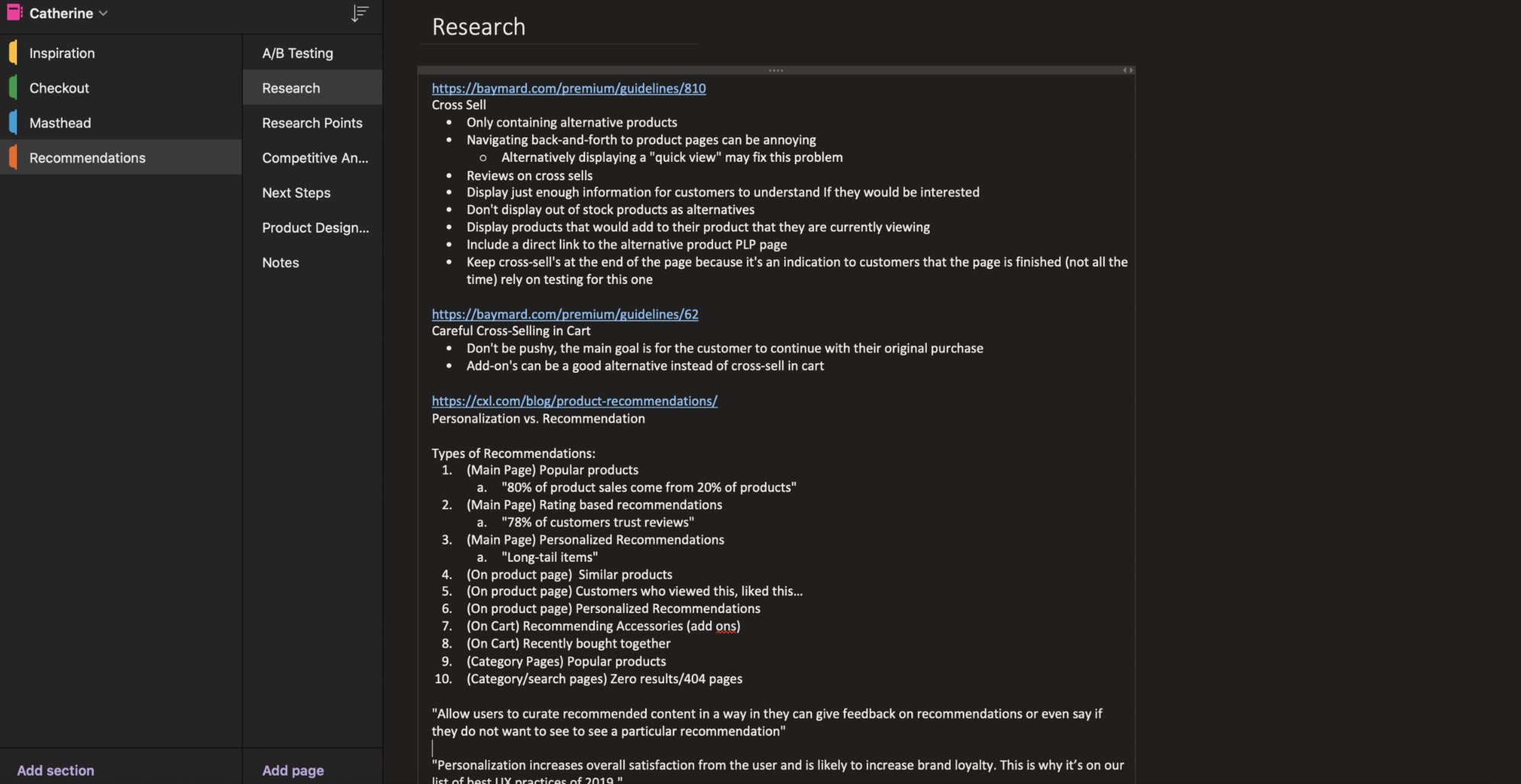
Research synthesis — Baymard cross-sell guidelines, personalization vs. recommendation types, 10 carousel placement contexts
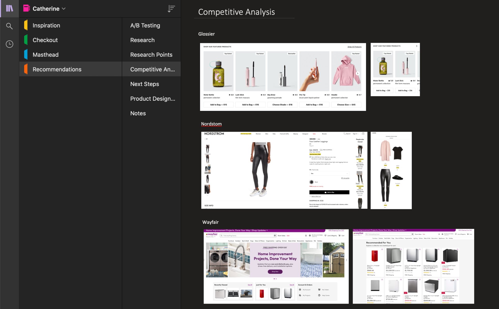
Competitive analysis — recommendation patterns across Glossier, Nordstrom, and Wayfair
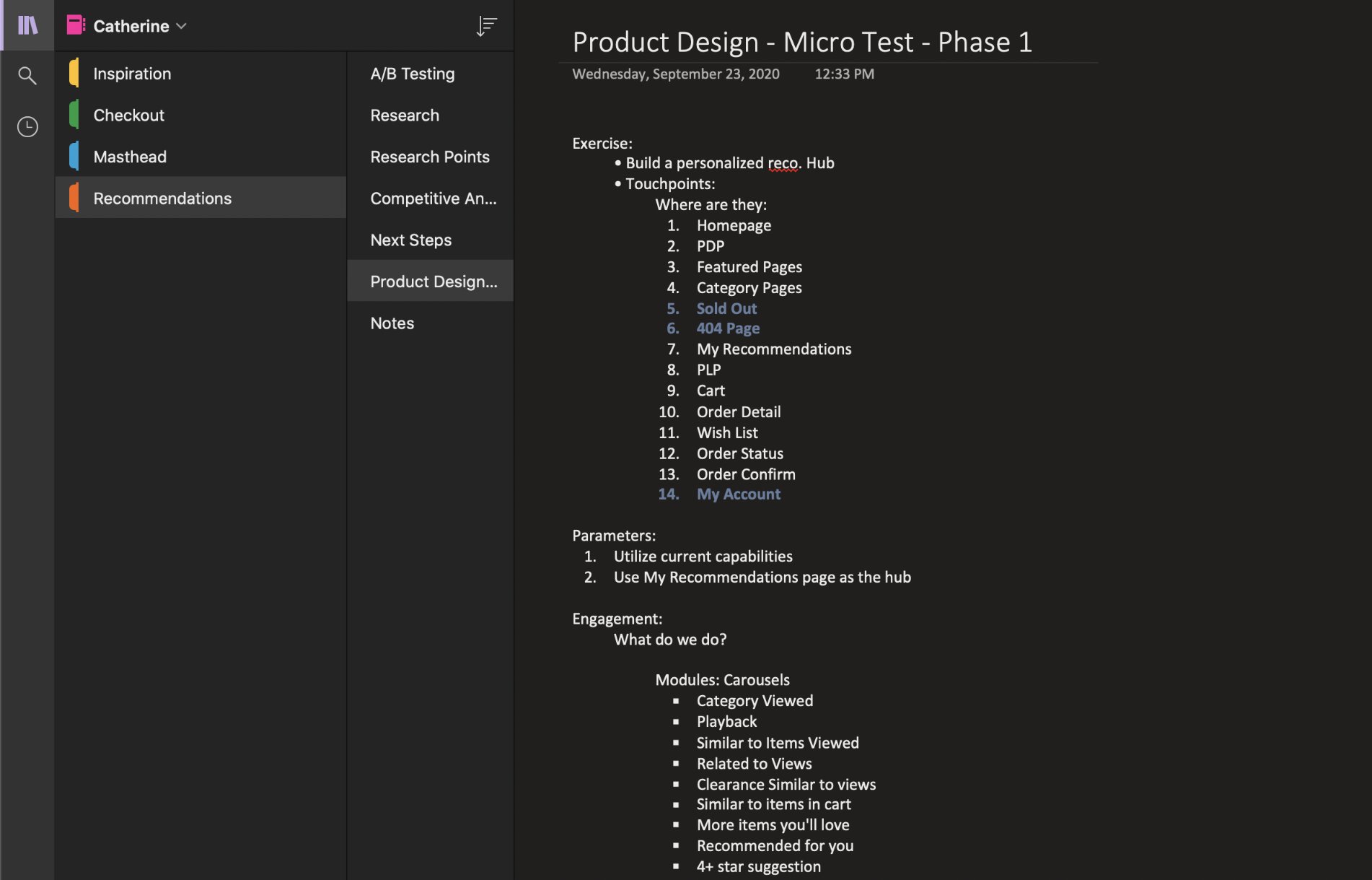
Product Design — Micro Test Phase 1 planning: 14 touchpoints mapped, carousel module types defined
Carousel Design Explorations
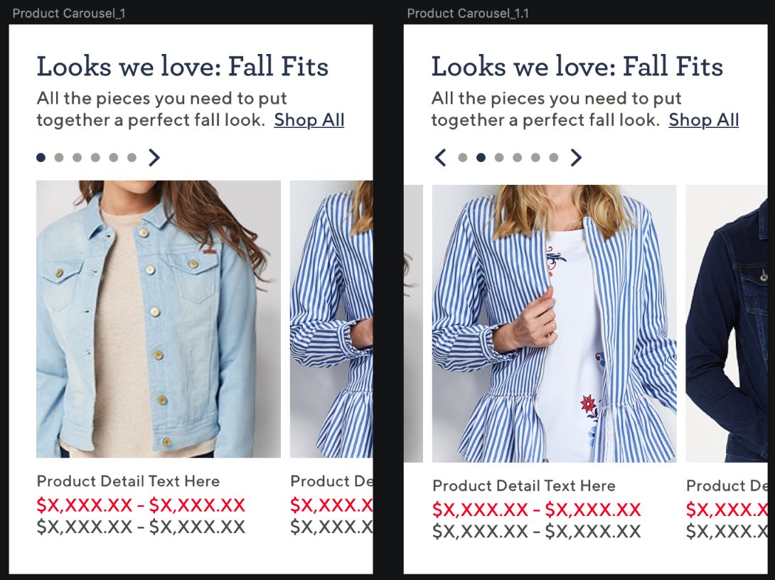
Carousel 1 vs 1.1 — pagination dot placement and navigation arrow variants
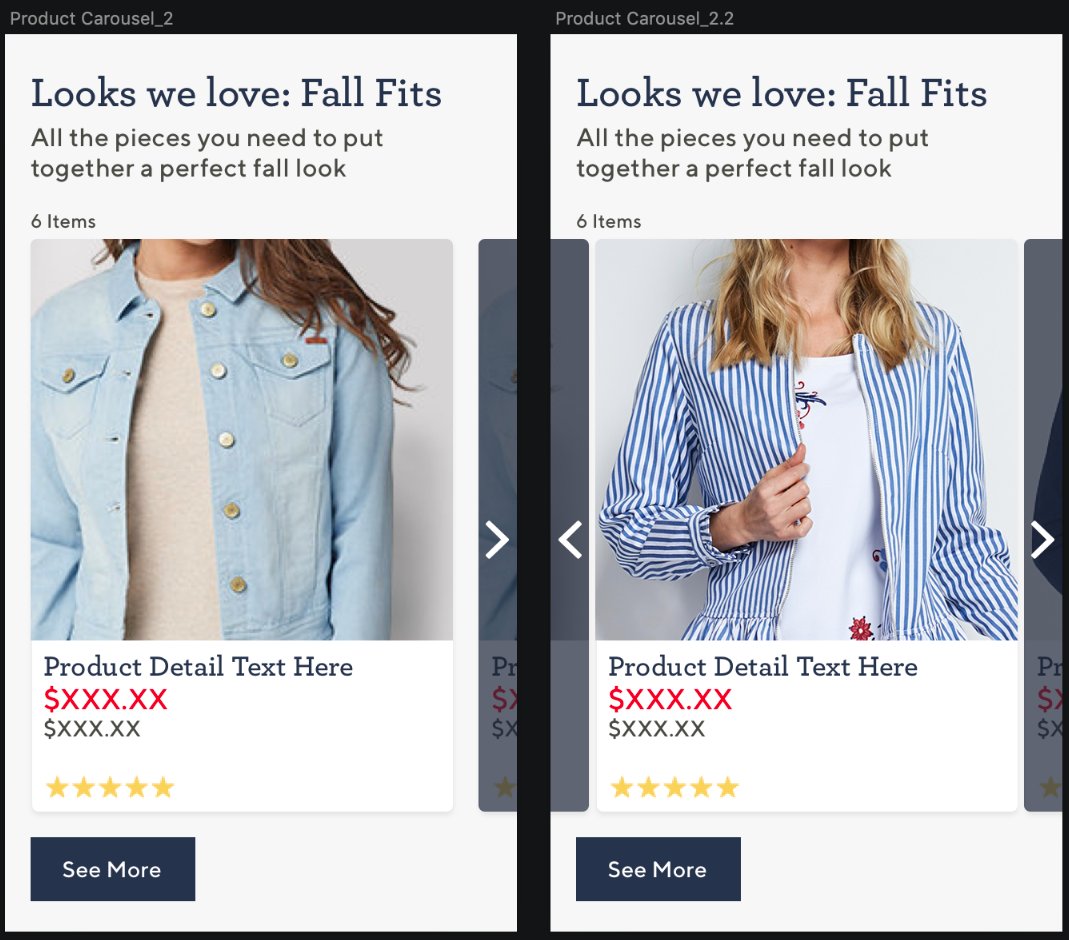
Carousel 2 vs 2.2 — card layout with partial next-item reveal
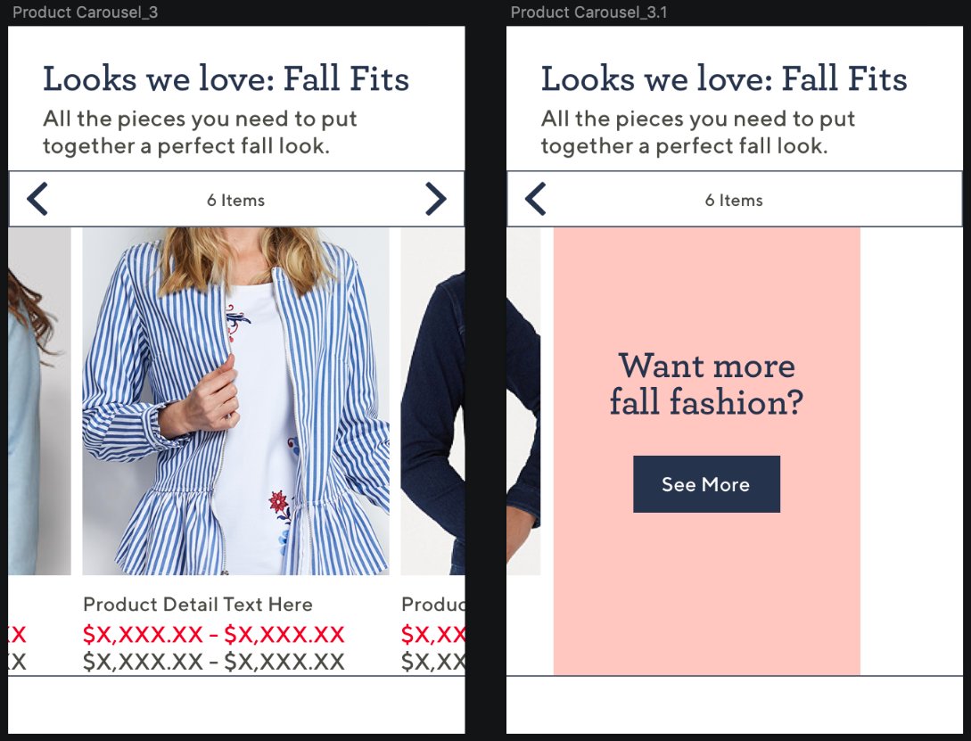
Carousel 3 vs 3.1 — end-of-carousel CTA card: "Want more fall fashion?" exploration
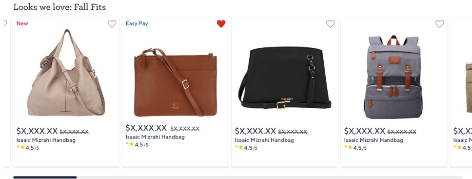
Live carousel — "Looks we love: Fall Fits" bags with New / Easy Pay labels and wishlist
Scroll interaction prototype — carousel scroll behavior animation
Recommendation Placements — Live Patterns
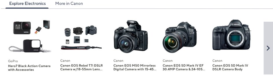
Explore Electronics — tab-style recommendation ("More in Canon" variant)
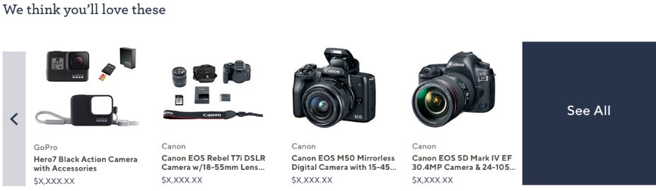
"We think you'll love these" — personalized recommendation with See All end card
QVC · E-commerce · Product Experience
Product Detail Page Redesign
Redesigned QVC's product detail page across apparel and electronics — owning the full design lifecycle from CX research and competitive analysis through dev specs, button state systems, and production-ready mobile designs.
Focus
Rethought product detail hierarchy for both apparel and electronics — designing for key decision points, warranty presentation, and button states across desktop and mobile contexts.
Deliverables
Strategic Value
PDP design is conversion-critical — every decision about information hierarchy, trust signals, and interaction patterns directly affects purchase behavior.
Designed Interfaces — QVC Product Detail Page
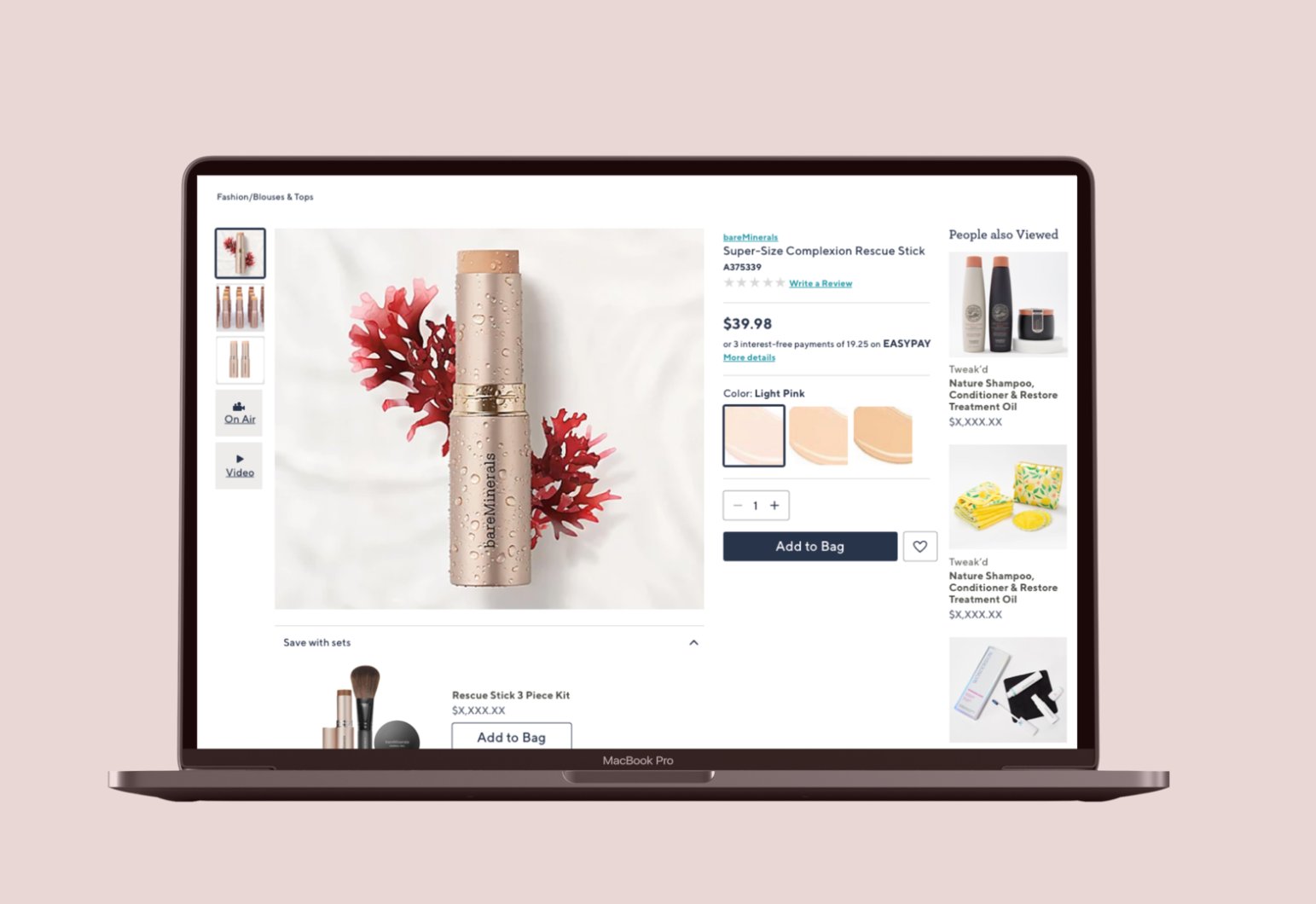
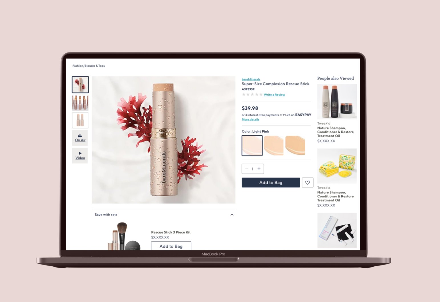
QVC Product Detail Page — bareMinerals Rescue Stick with People Also Viewed rail, color swatches, Save with Sets
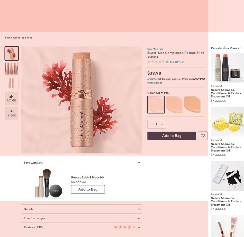
PDP flat view — full layout with image gallery, EasyPay, color selection, reviews, and cross-sell
Research & Strategy — CX Runway
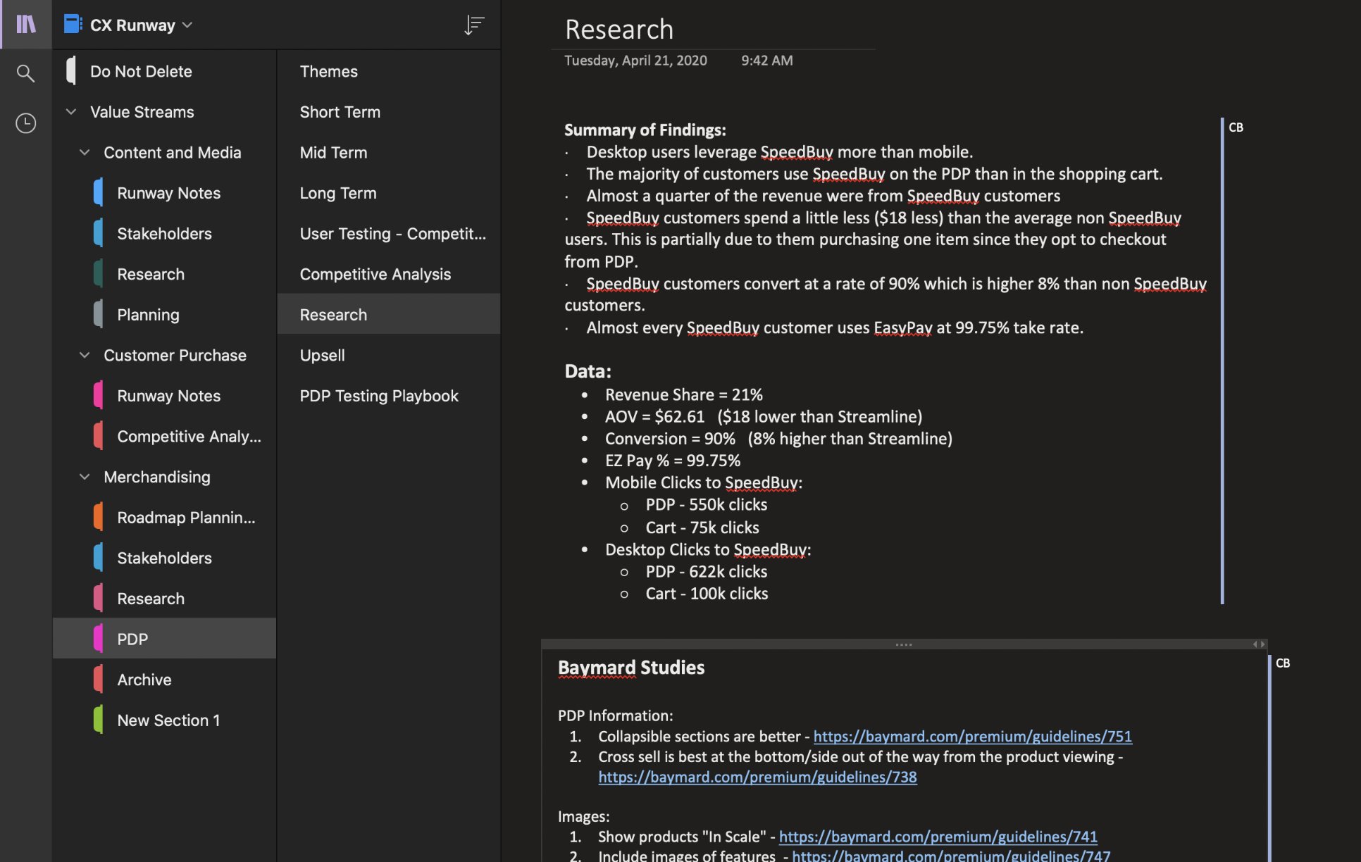
CX Runway Research — SpeedBuy data: 90% conversion rate, 21% revenue share, 550k mobile PDP clicks. Grounded design in real metrics.
Competitive analysis — PDP patterns across AE, Anthropologie, Glossier, Nordstrom, Target, and Wayfair
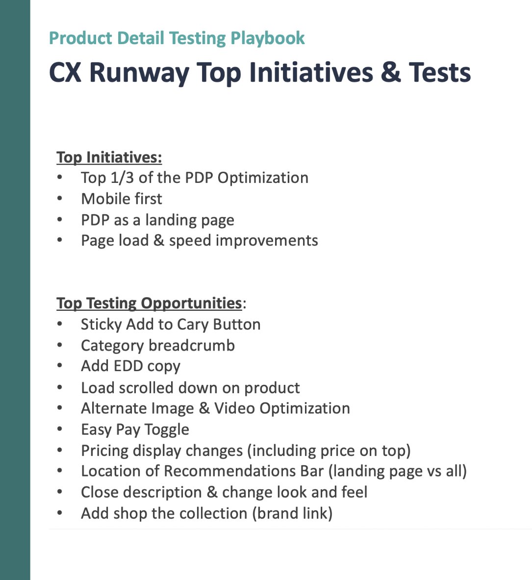
PDP Testing Playbook — top initiatives (mobile first, PDP as landing page) and 10 A/B test opportunities
Design System — Button States & Interactions
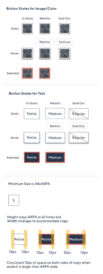
Button states system — image/color + text variants across in stock, waitlist, sold out, hover, selected. 44px minimum touch target.
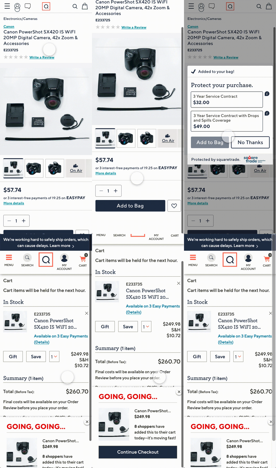
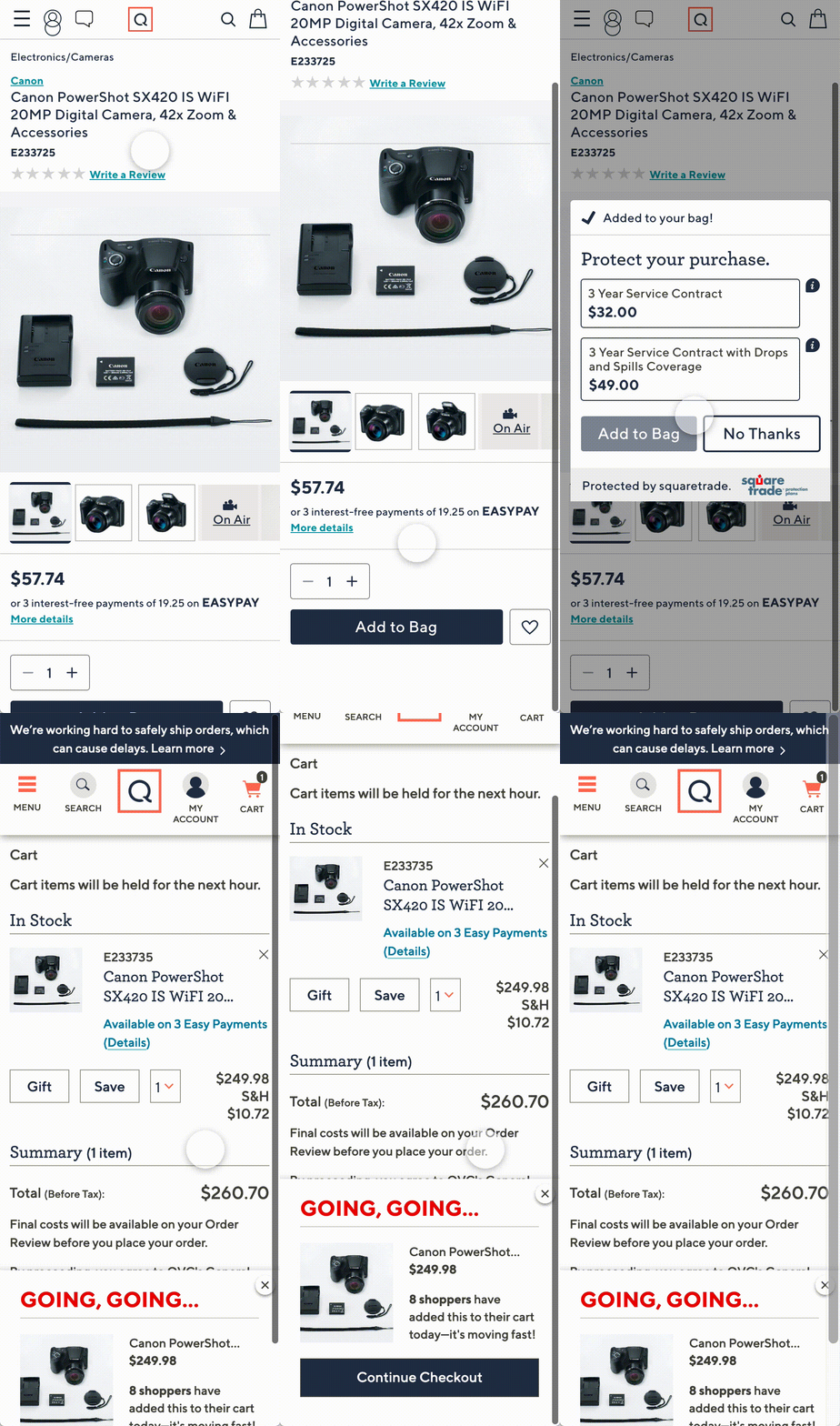
Warranty modal — animated post-add-to-cart upsell for product protection
Dev Specs — Desktop & Mobile
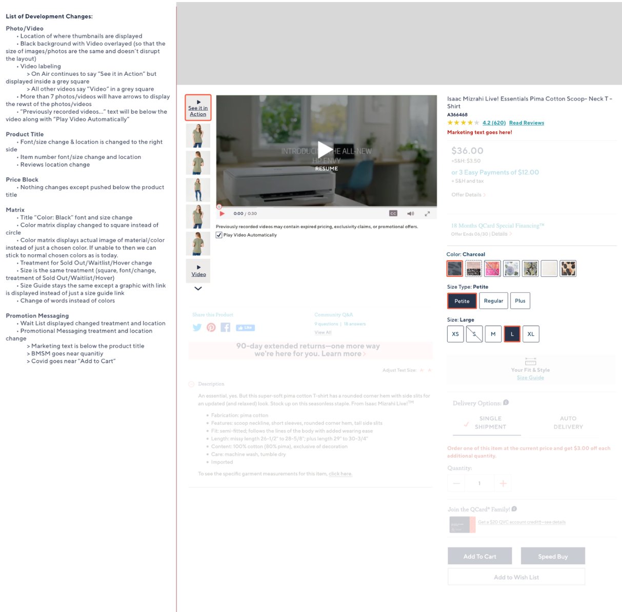
Desktop PDP annotated spec — photo/video, product title, price block, color matrix, promotion messaging
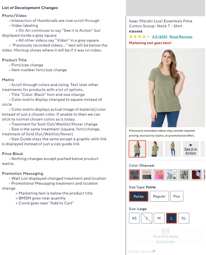
Mobile PDP annotated spec — scroll-through thumbnails, square color matrix with material images, size guide, delivery options
Final Mobile Designs
Mobile PDP — apparel product with color swatches and EasyPay
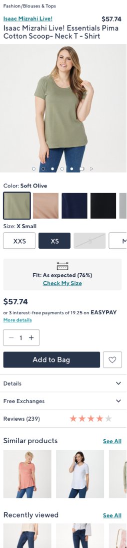
Mobile PDP flat — Similar Products + Recently Viewed rails, size fit indicator
Mobile PDP electronics — warranty upsell modal, EasyPay, SpeedBuy CTA
AI Labs · FinTech · Dashboard Design
Axiom Client Dashboard
Designed a financial dashboard that allows users to easily digest their household's financial information — dividing complex data into digestible sections without overwhelming the user.
Challenge
Financial dashboards often overwhelm users with data. The goal was to design an overview of a household's financial picture that felt clear and digestible — not like a data dump.
Approach
Process
Research-grounded from the start — included whiteboarding and user testing sessions before moving to high-fidelity design, ensuring the architecture matched real user mental models.
Designed Interface — Axiom Client Dashboard
Axiom — financial dashboard with My Advisor panel, 90% Probability of Success indicator, Investment Allocation donut chart, and Net Worth summary
Process — Discovery, IA & Whiteboard Sessions
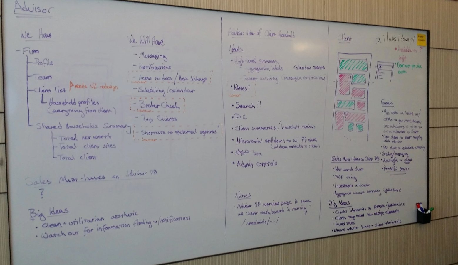
Advisor session — "We Have / We Will Have" framework: messaging, notifications, scheduling, household profiles, top clients. Big ideas: clean utilitarian aesthetic, avoid information flooding.
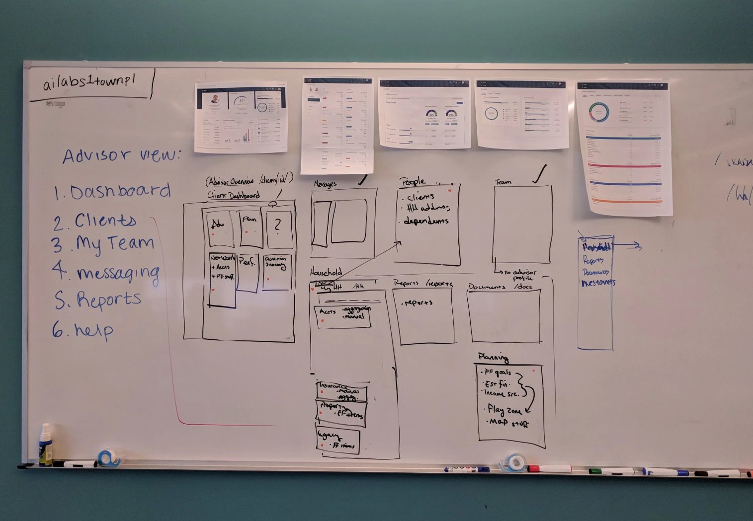
Advisor view IA — 6 navigation areas (dashboard, clients, team, messaging, reports, help) with sketched wireframes pinned above
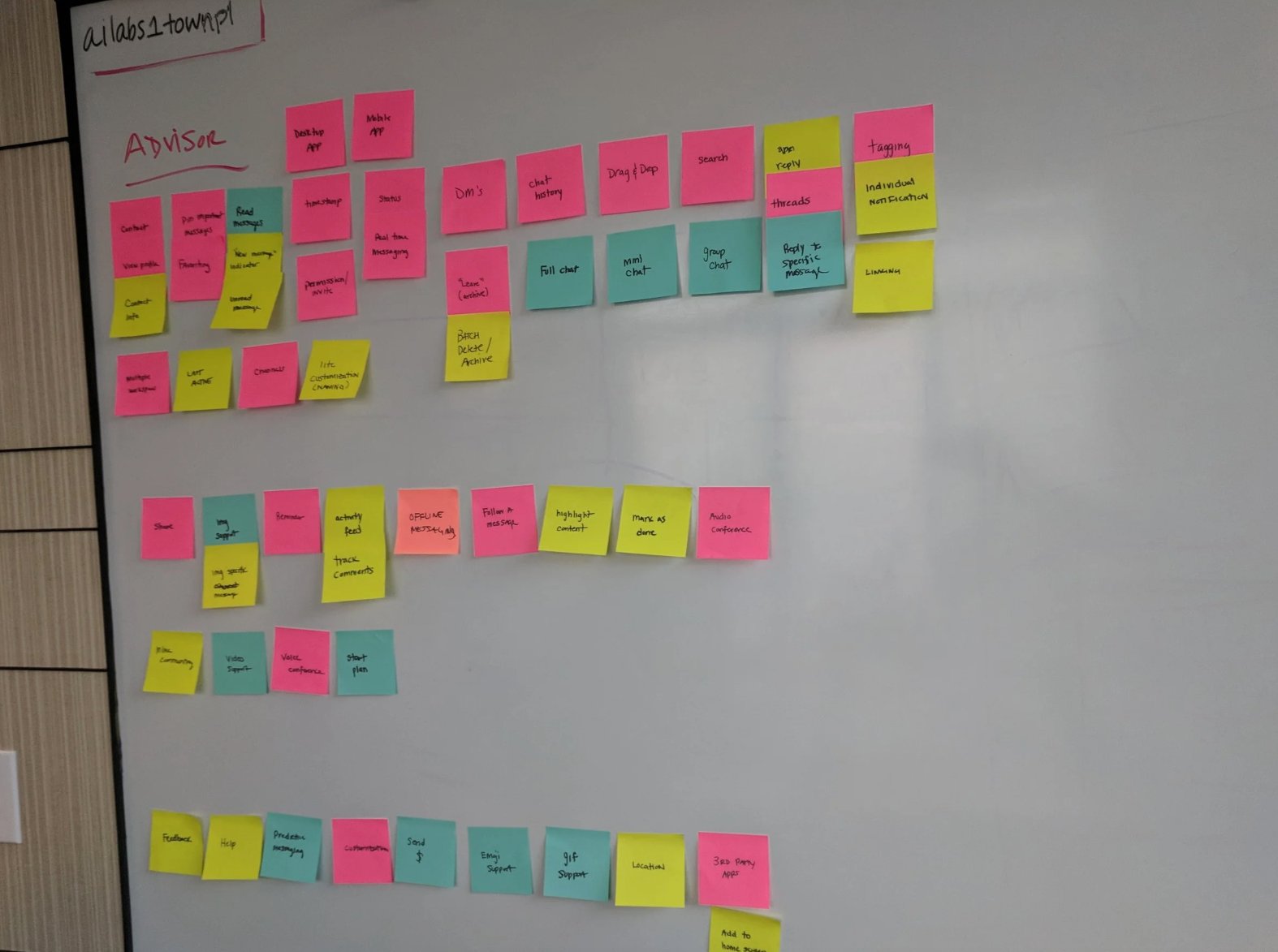
Messaging feature IA — sticky note mapping of DMs, chat history, full/mini/group chat, threads, search, tagging, offline messaging, audio conferencing
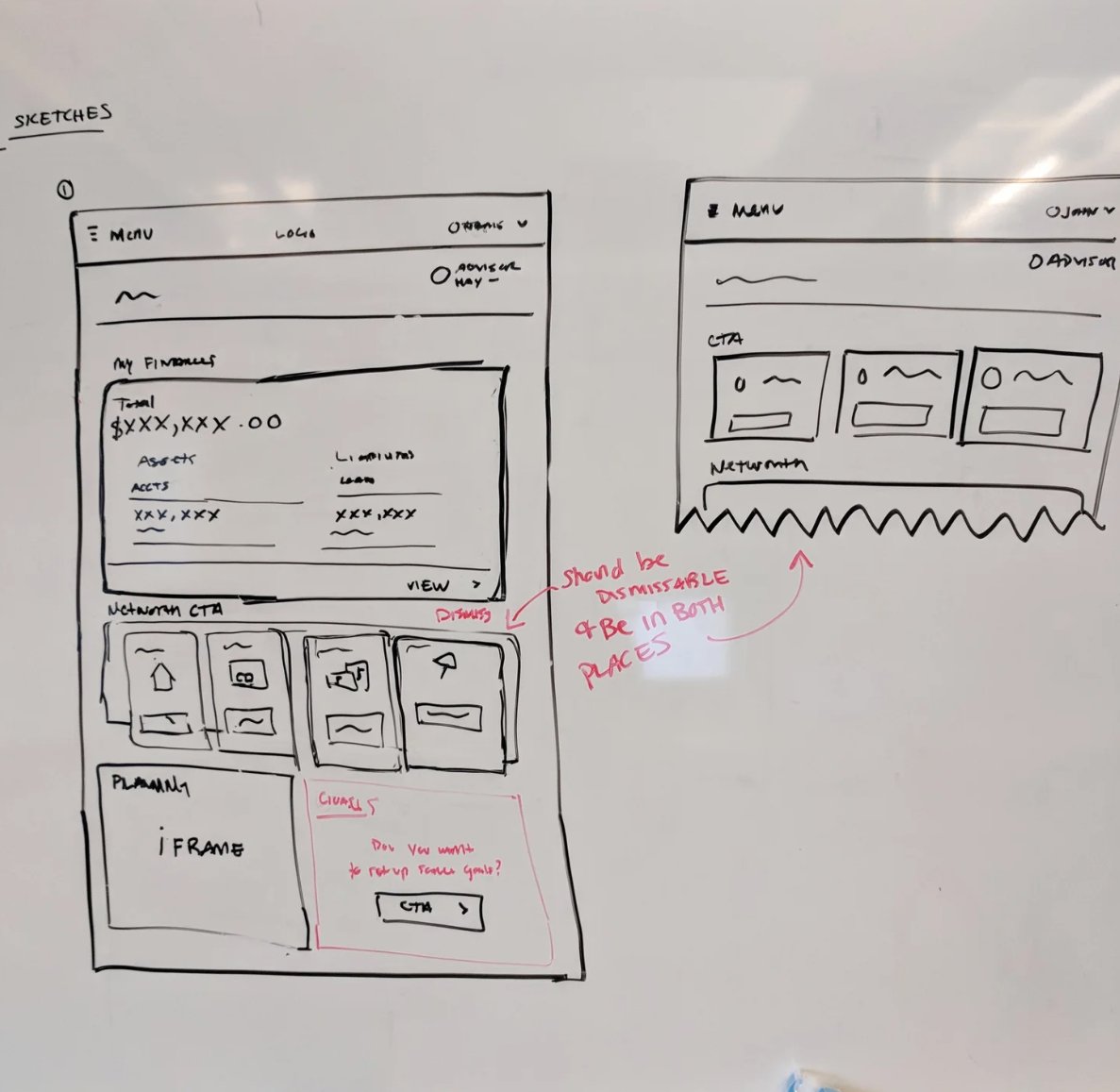
Dashboard sketches — My Finances widget, Net Worth CTA cards (dismissable), Planning iframe with Goals prompt
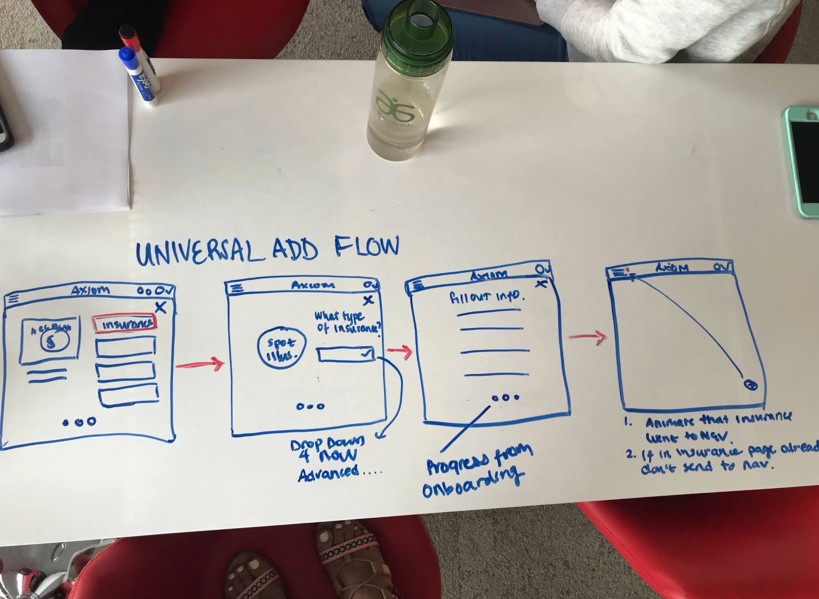
Universal Add Flow — 4-step sketch: select category → type selection → fill info → animated confirmation with nav routing logic
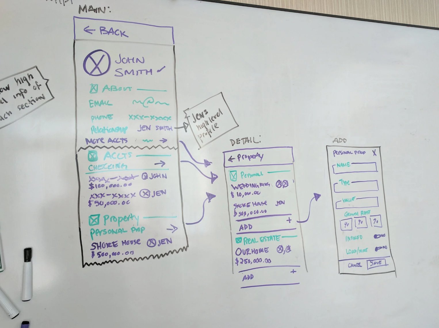
Client profile wireframe — main view (about, accounts, property), detail view (personal property, real estate), add flow (name, type, value, growth rate)
Axiom Messaging — Designed Interfaces
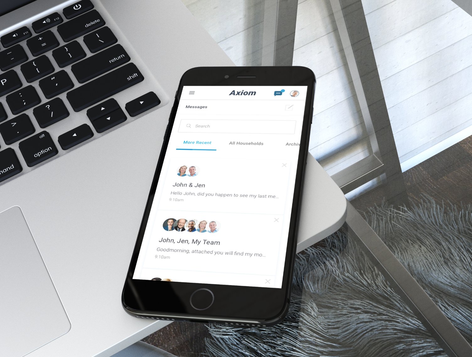
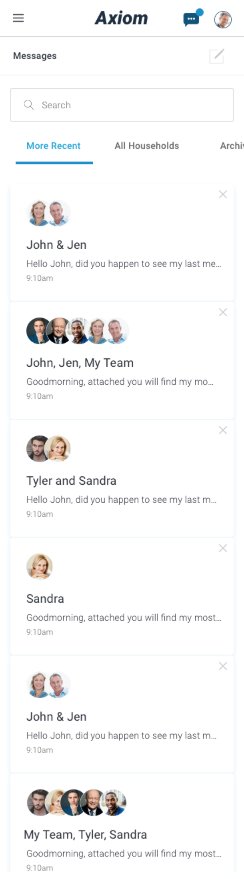
Axiom Messaging — mobile message list with More Recent / All Households / Archived tabs and grouped household conversations
Mobile messages — conversation list with household groupings, avatar stacks, and timestamps
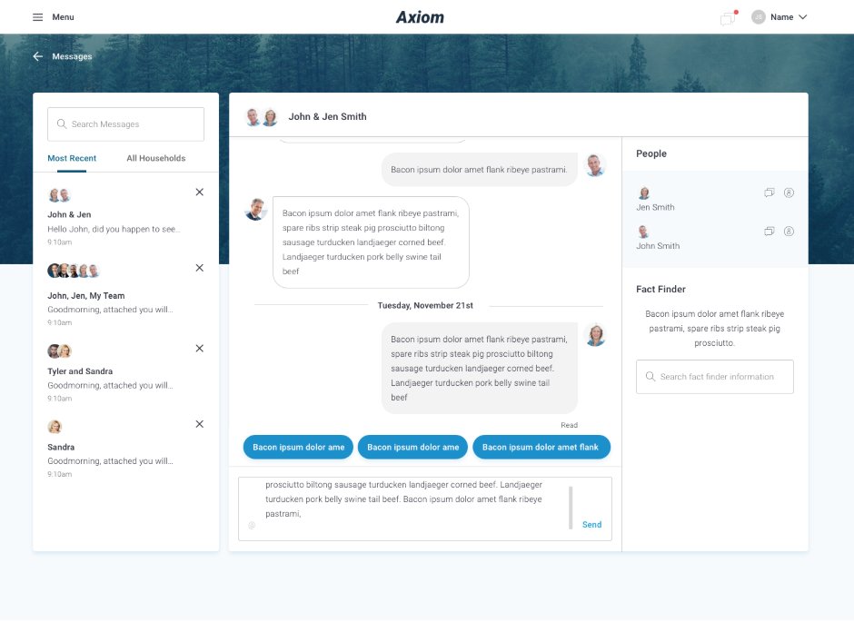
Desktop messaging — three-panel layout: conversation list · thread view with read receipts and quick replies · People + Fact Finder sidebar
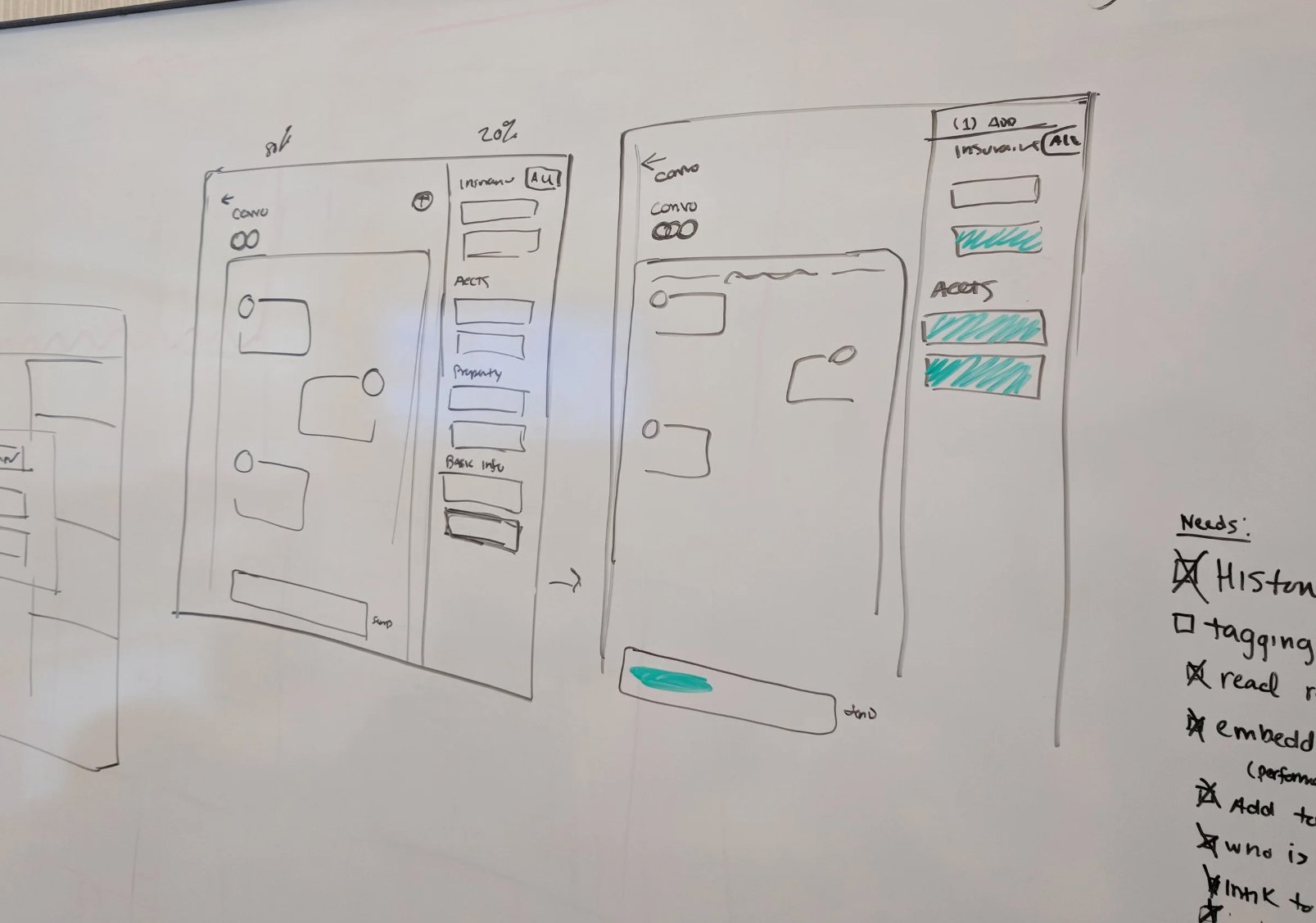
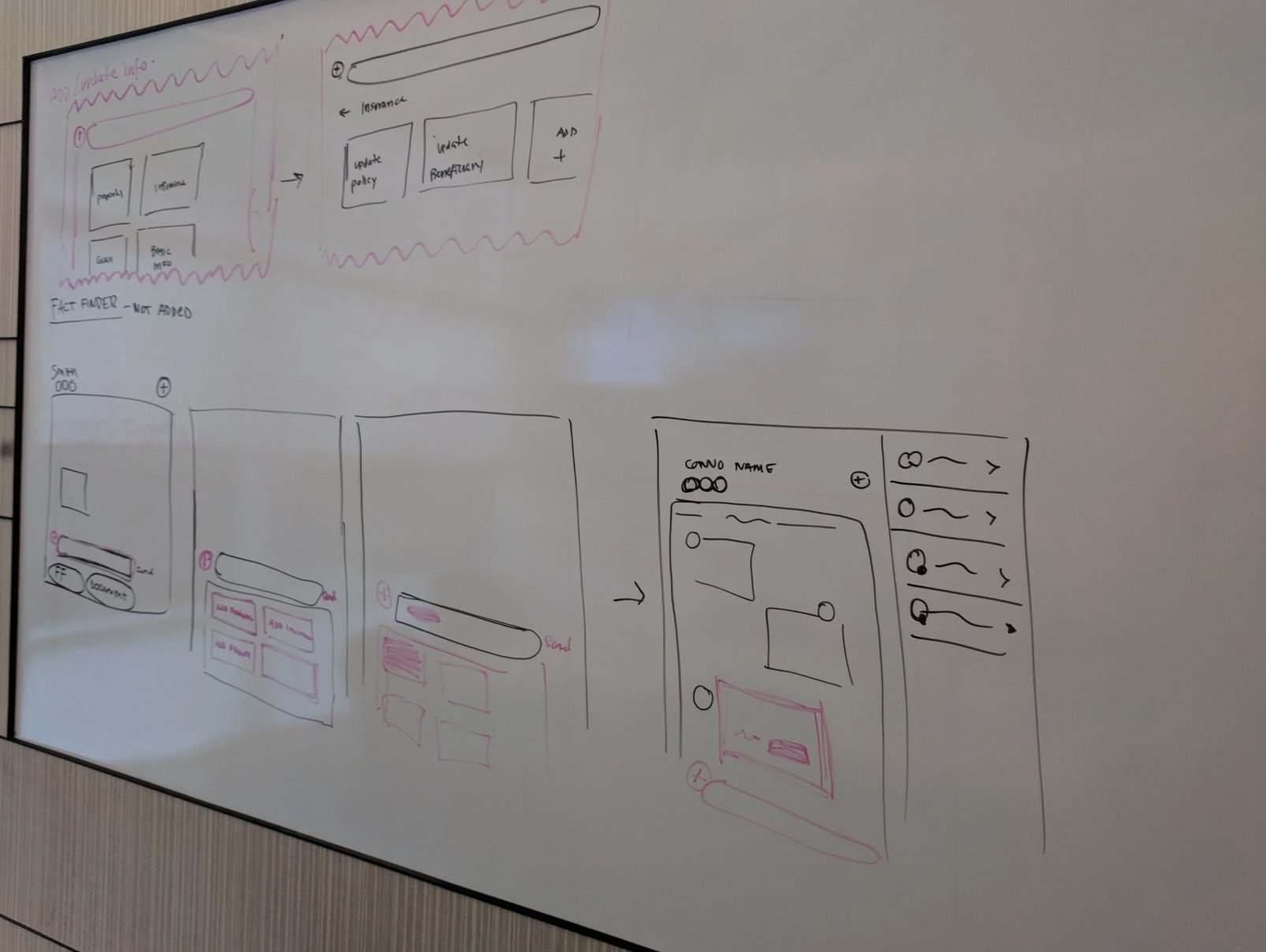
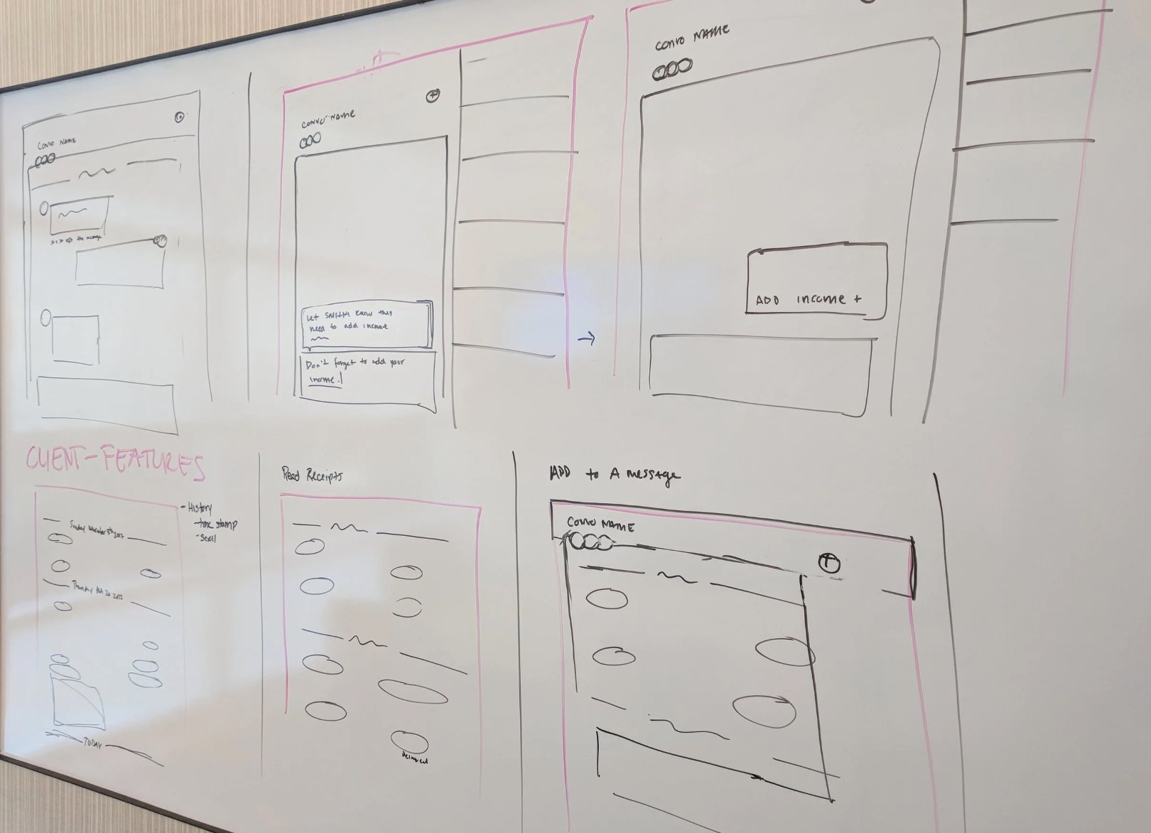
Messaging whiteboard — insurance update flow, notification states, conversation view with send + document CTAs
Client features whiteboard — message history, read receipts, add to a message, offline messaging notification flow
Tagging and account linking — conversation with insurance/accounts/property sections, needs checklist: history ✓, tagging ☐, read receipts ✓, embedded content ✓
Xfinity · Decision Tools · Conversion
Help Me Decide Tool
Designed Xfinity's "Help Me Decide" tool — a multi-step, personalized quiz experience that filtered offers based on user inputs, removing decision paralysis and driving a significant lift in BuyFlow conversion.
The Problem
Users were abandoning the purchase flow due to decision paralysis when faced with product options. They needed a guided experience to help them choose the right product with confidence.
The Solution
Designed a decision-making tool that asked the right questions, filtered options, and guided users directly into the BuyFlow — reducing friction at the most critical conversion point.
Outcome
Significant conversion rate lift — a clear example of how decision design, not just visual design, drives measurable business outcomes.
Designed Interface — Help Me Decide Tool
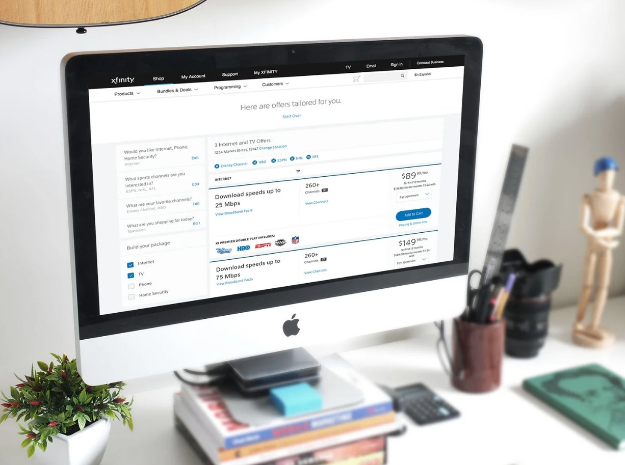
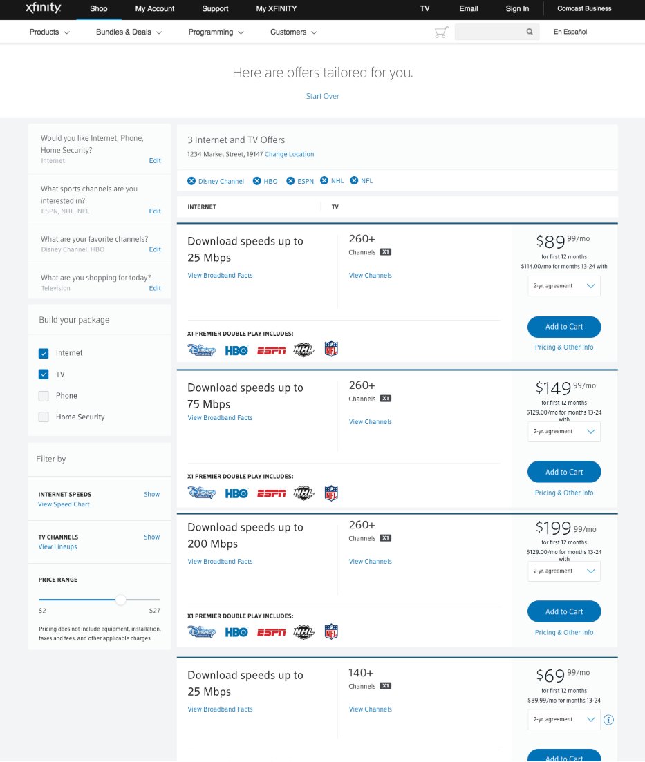
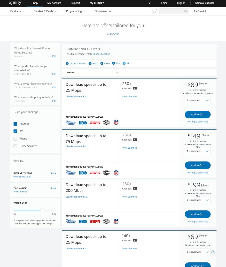
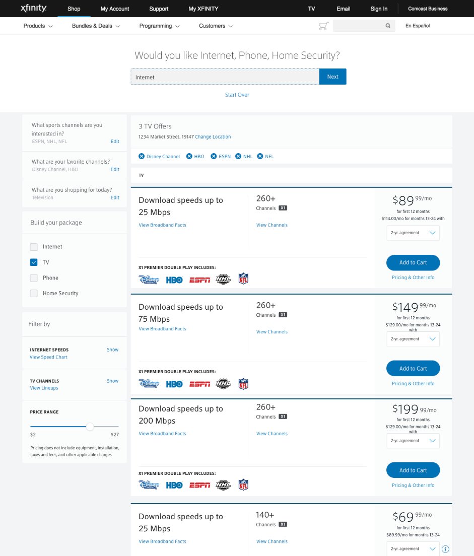
Help Me Decide — "Here are offers tailored for you" results with left-rail answer summary, editable filters, and personalized package grid
Quiz Flow — Step by Step
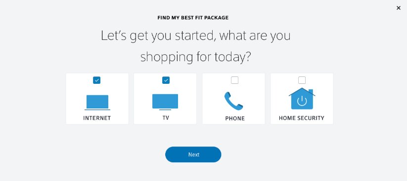
Step 1 — "What are you shopping for today?" Internet + TV selected
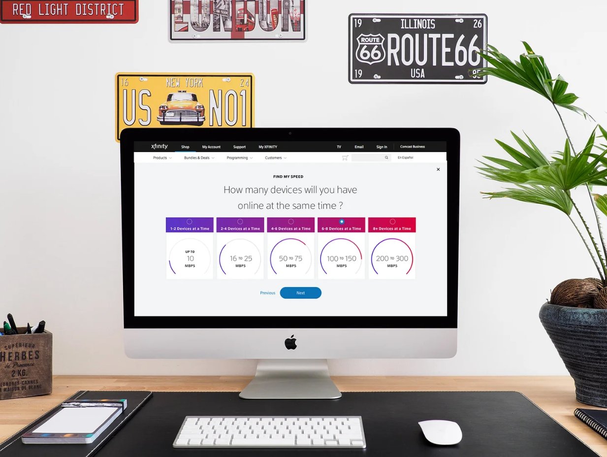
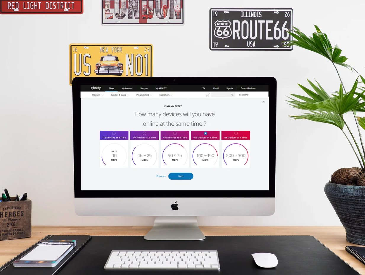
Step 2 — "Find My Speed" — device count mapped to recommended Mbps ranges (10–300 Mbps)
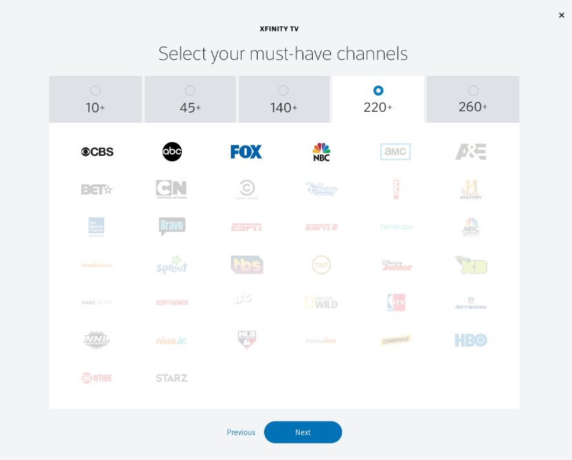
Step 3 — Must-have channel tier selector (10+ to 260+) with full channel grid
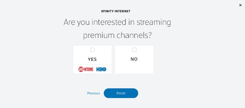
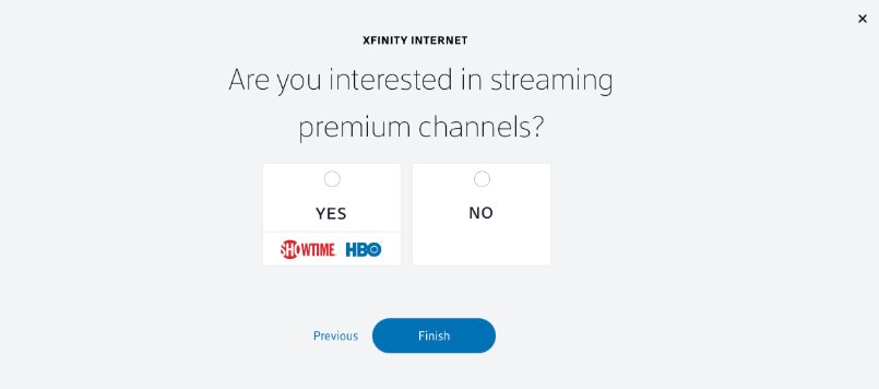
Step 4 — "Are you interested in streaming premium channels?" Yes (Showtime + HBO) / No
User Flow & Results
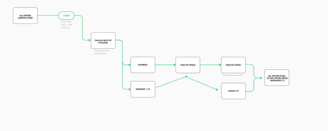
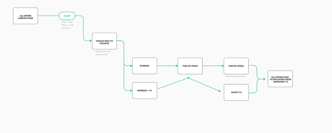
User flow — All Offers Landing Page → Find My Best Fit Package → Internet or Internet+TV → Find My Speed → filtered results
Find My Speed — speed tier modal with device count selector, in context of Xfinity shop
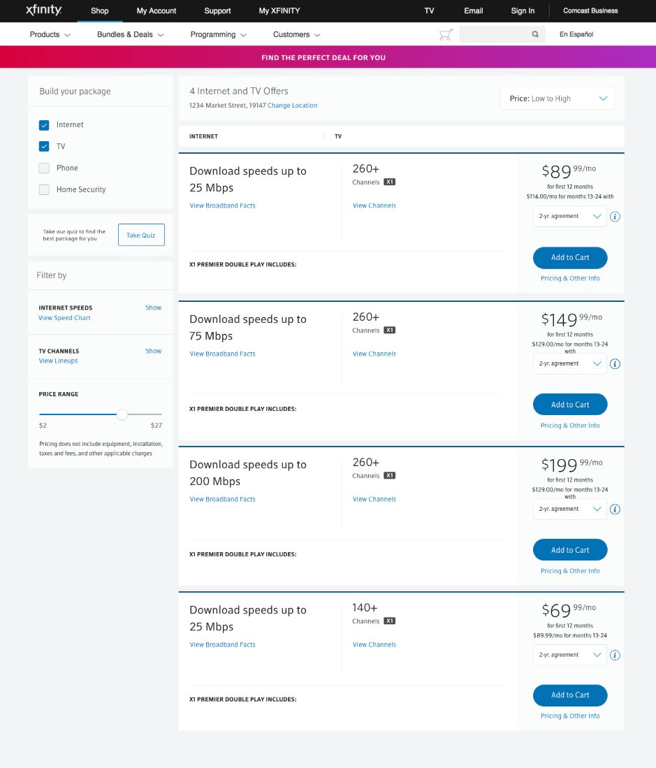
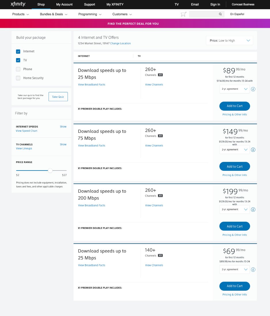
"Find the Perfect Deal For You" — 4 packages filtered by quiz answers, pre-sorted by price
Results with editable answer summary rail and 3 filtered Internet + TV offers
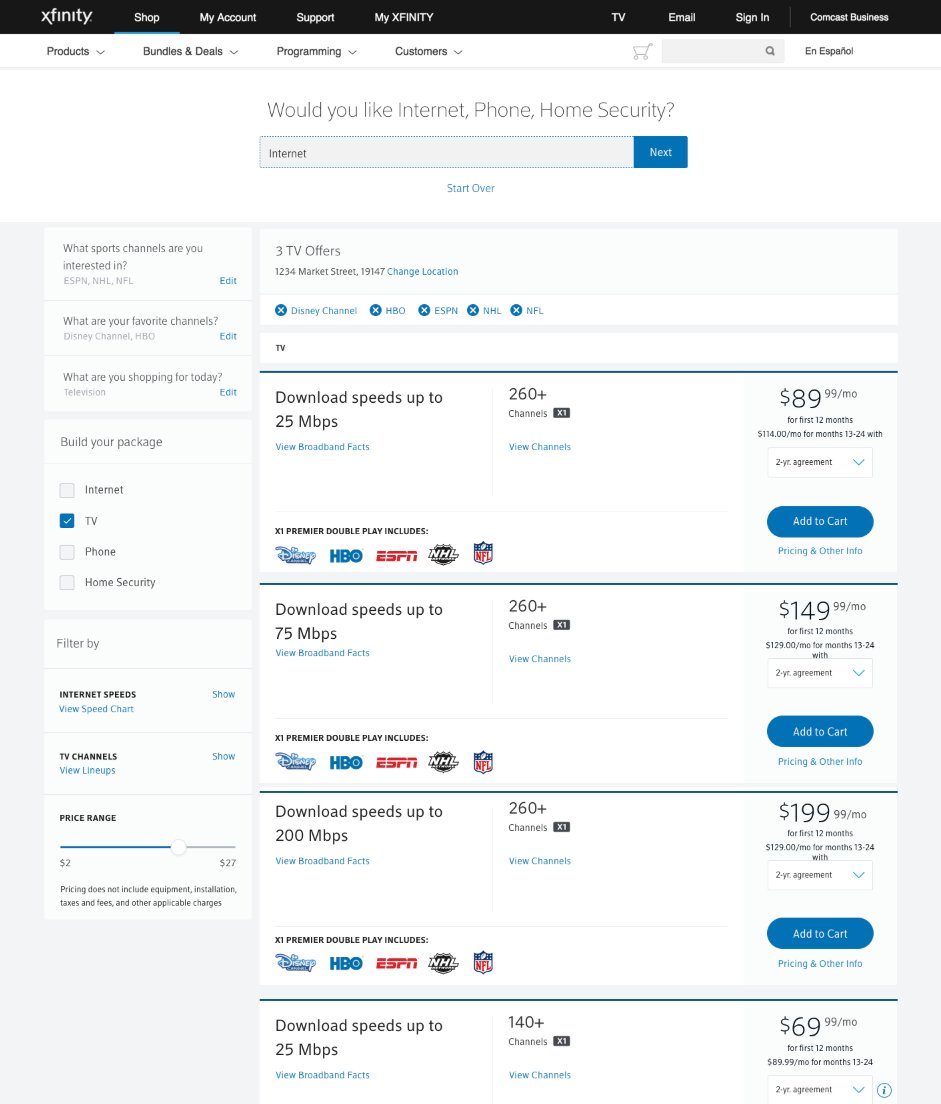
Inline editing — first question active mid-results, editable without losing context
Why I'm the right fit
15 years of end-to-end product design across financial services, e-commerce, fintech, and telecom. Deep experience designing complex flows across mobile and web, building and governing design systems, mentoring designers, and translating research and data into high-quality, production-ready product experiences. I've led work from the first whiteboard to the final handoff, always grounded in user needs and business outcomes.
I translate complex financial systems into experiences users can navigate — making high-stakes decisions approachable, clear, and actionable at every step.
I mentor junior and mid-level designers, lead critique sessions, and advocate for UX having a voice in product planning and decision-making. I build shared standards that keep quality consistent as teams and products grow.
I've built design systems from scratch and led adoption across multi-team organizations — from founding QVC's first design system (QEL) to driving the Constellation (C11n) migration at Vanguard. Systems work is where craft meets org-level strategy.
Complex systems.
Polished execution.
Research first,
always.
I bring 15 years of end-to-end product design — across mobile and web, financial services, e-commerce, and fintech. I design complex flows, build and govern design systems, mentor designers, and advocate for UX standards that keep quality consistent at scale. Research-informed from day one, and always built to ship.
Get in touch →Medium · Vanguard UX Publication
Published on the Writing & Thought Leadership — writing about empathy in design practice and how teams can build and sustain it as a core skill, not just a workshop activity.
Read on Medium →Medium · Vanguard UX
"Empathy: Why It's Good and How to Nurture It"
Writing about design practice — how empathy shapes decision-making and what it takes to build it as an organizational muscle, not just an individual skill.
medium.com/vanguard-ux